If your sign needs a sign explaining the sign then it’s a poorly-designed sign.
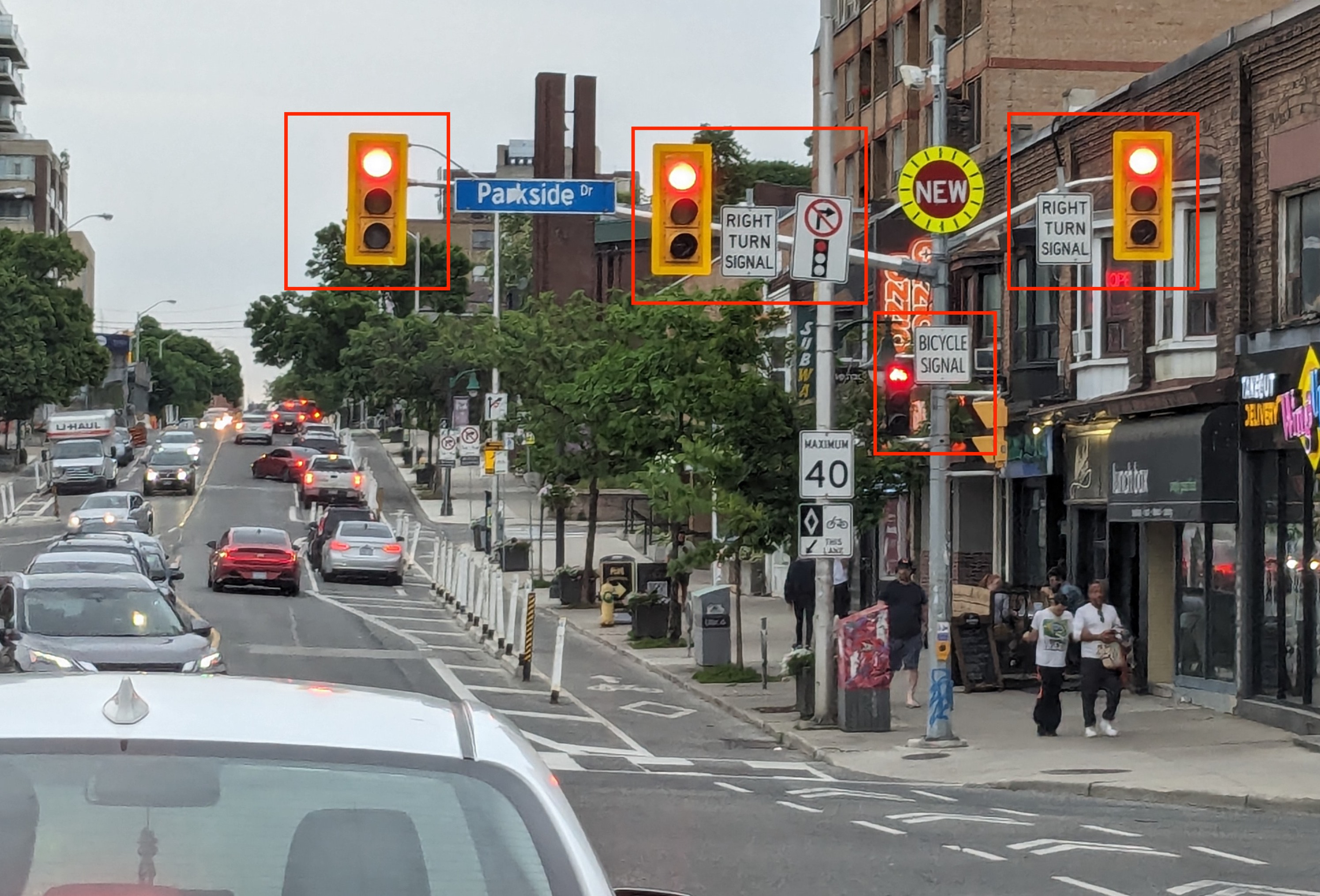
Let me present a few examples. I’ll start with the intersection at Bloor and Parkside in Toronto shown below.

There are four lights in this image: one for the through traffic, one for the cyclists, and two for the right-turn traffic. Both the bicycle signal and the right-turn signal have additional signs adjacent to them explaining what those lights are for. The placement of these explanatory signs is inconsistent: two are to the right of the signal, one is to its left.
[Read More]